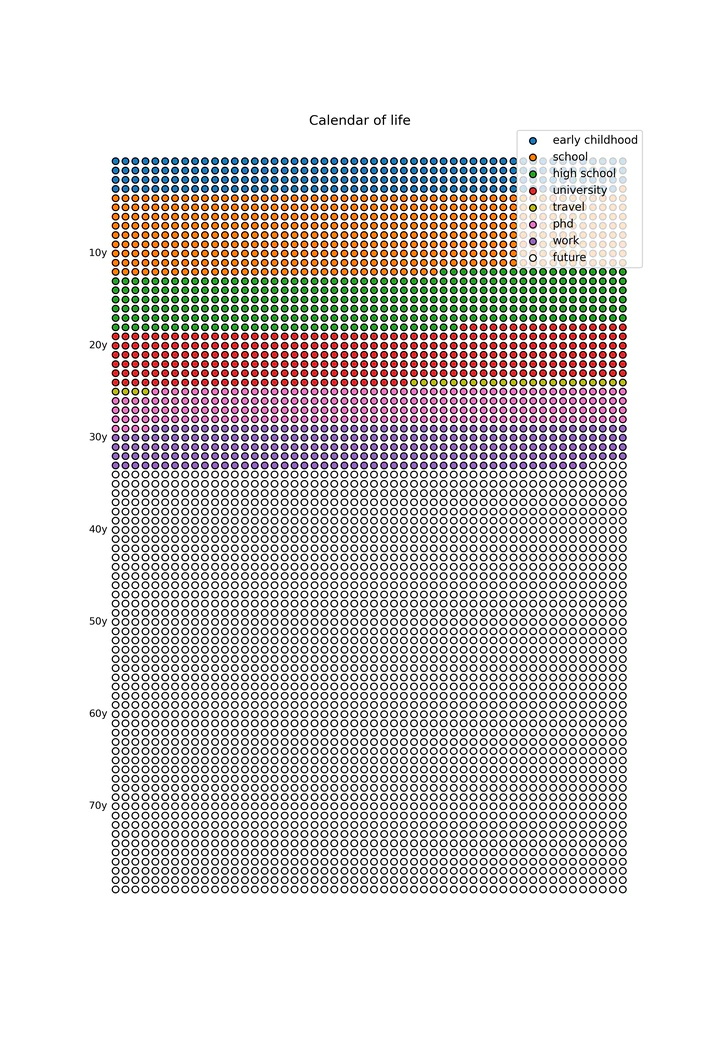
Calendar of Life 📅
🎄🎁 Advent of Open Source – Day 01/24: A Python project to visualize life in weeks, reminding us of time’s passage.

(See my intro post.)
Visualizing the finite weeks of our lives, because apparently, I needed another reminder of my mortality!
📖 Origin Story
You know how sometimes you’re just casually browsing the internet, not looking to have an existential crisis? Well, that’s exactly what happened when I stumbled upon Tim Urban’s Wait But Why post “Your Life in Weeks” and saw Kurzgesagt’s “Calendar of Your Life” poster. Instead of just feeling mildly anxious about the finite nature of existence like a normal person, I decided to cope by writing some Python code. Because that’s what we do, right?
🔧 Technical Highlights
The project uses matplotlib to create a grid where:
- Each row represents one year (up to 80 years, optimistically speaking!)
- Each column represents one week (52 weeks per year)
- Different colors show different life stages (early childhood, school, university, etc.)
- The current week blinks in the animated version, just in case you needed a more urgent reminder of time passing
- Supports both dark and light modes, because existential dread comes in all themes
One interesting technical detail is handling the fact that 52 weeks isn’t exactly one year. The code uses a small correction factor (days_per_week = 365.25 / 52) to ensure the visualization stays accurate over many years. Yes, I made sure your existential crisis would be mathematically precise.
📊 Impact
With its whopping 5 GitHub stars, this project clearly hasn’t taken the world by storm. But hey, sometimes the best tools are the ones we make for ourselves, right?
🎯 Challenges and Solutions
The main challenges were (this was actually a very simple one):
- Accurately mapping life events to week numbers (turns out life doesn’t fit neatly into boxes)
- Creating smooth animations for the current week indicator (because a blinking dot really drives home the whole “time is passing” thing)
- Handling the 52 vs 52.18 weeks per year discrepancy (thanks, Earth’s orbit)
- Making the visualization work well in both dark and light modes (for viewing your life calendar at any time of day)
💡 Lessons Learned
This project taught me that sometimes the most impactful tools are the simplest ones. Sure, it’s just a bunch of dots on a grid, but each dot represents a week of life - past, present, or future. It’s a humbling reminder that while we can’t add more dots to our grid, we can try to make each one count.
Want to contemplate your own mortality in a more organized way? Check out the project on GitHub!
#OpenSource #Python #DataVisualization #Programming